
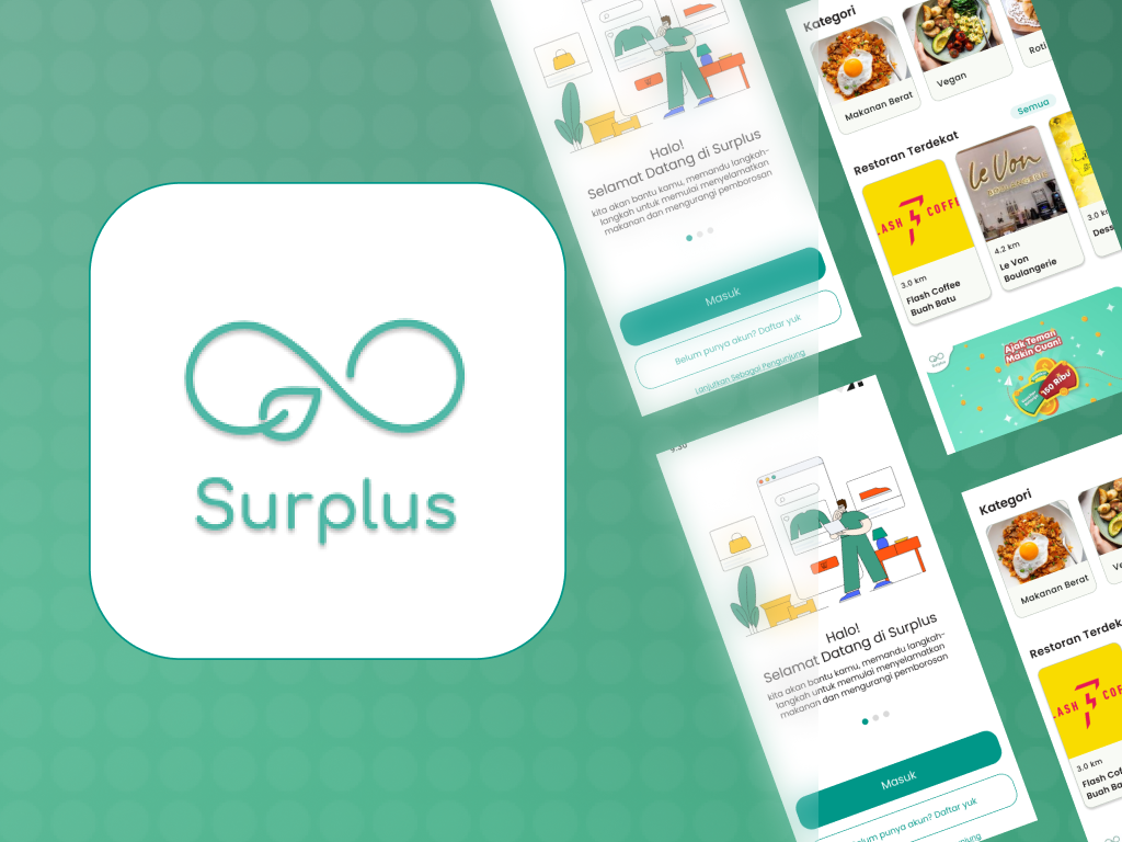
1. Project Background & Overview
This UI/UX project was executed during the Kampus Merdeka Certified Independent Study (SIB) Cycle 5 program at GreatEdu. Our creative team comprised Jessica Anggraeni (Team Leader & UX Researcher), Qolbul Muzaki (UI Designer), Candra Purnama Aji (UI Designer), and A’laa Dzulqarnain (UX Writer & UX Researcher).
The objective was to redesign Surplus, one of Indonesia’s food rescue platforms. Surplus helps reduce ecological waste by allowing restaurants to sell unsold surplus food and drinks at clearance discount rates before closing. This directly addresses the global issue of greenhouse gas emissions (specifically methane) generated by decomposing food waste.
2. Research & Problem Identification (Design Thinking)
We adopted the Design Thinking methodology, scope-bounded from the Empathize stage through Prototype.
Usability Hypotheses
Before conducting field research, we established five user behavior hypotheses:
- Users do not know when out-of-stock items will become available again.
- Users are unaware of menu updates in nearby restaurants.
- Users assume there are very few or no restaurants active in their area.
- Users cannot save specific food items for future reference.
- Users do not know how much money they save when buying surplus food.
Usability Testing & User Interviews
We interviewed 5 participants representing our primary persona: college students aged 19-25 living in boarding houses (kos) who frequently order food online and actively seek discount deals. Testing sessions were conducted remotely via Zoom and Google Meet.
Validated Findings
The interviews validated all 5 hypotheses, highlighting severe user pain points:
- Unclear Restock Windows: Users were frustrated by the lack of clear restock schedules for sold-out items.
- Missing Alerts: Users could not track their favorite restaurants for updates.
- Lack of Save/Favorite Feature: There was no wishlist function to bookmark preferred items.
3. Journey Mapping & Hook Canvas
To understand the core interaction loops and psychological triggers of the users, we built a Hook Canvas and a User Journey Map:
- Trigger (Internal): Desires cheap, instant food; anxiety about managing daily budgets.
- Action: Opens the app, searches for food, filters by proximity, applies vouchers, and completes the payment.
- Variable Reward: Access to high-quality food at up to 50% discount; feelings of eco-friendly contribution.
- Investment: Spending time browsing, configuring notification alerts, and building custom wishlists.
4. UI/UX Solutions & High-Fidelity Redesign
We proposed three core design solutions integrated with a friendly, fresh, and casual copywriting Tone of Voice:
Feature 1: Restaurant Follow & Notifications
- Problem: Users missed active stock updates.
- Solution: Added a Follow button on restaurant detail headers. Users receive real-time push notifications when followed merchants list fresh surplus items.
Feature 2: Clarity on Sold-Out Status
- Problem: The term "Not Available" was confusing and lacked context.
- Solution: Changed the text to "Out of Stock" (Stok Habis) and introduced an automated notice showing the next availability window (e.g., "Available tomorrow from 7 PM to 9 PM").
Feature 3: Integrated Food Wishlist
- Problem: Inability to save menu items for later comparison.
- Solution: Introduced a Wishlist (Heart Icon) on food listings, allowing users to aggregate favorite meals into a quick-checkout panel, regardless of current stock status.
5. Design Assets & Prototype
Visual Identity
- Primary Color: Forest Green (signifying environmental preservation and culinary freshness).
- Tone of Voice: Casual, reassuring, and active (e.g., "Don’t worry, let’s enter your email…" on recovery pages).
Interactive Artifacts
- FigJam Board: Figma Whiteboard Link