
1. Project Background & Overview
Indonesia possesses immense potential for natural water streams, but harnessing them for electricity is often hindered by the lack of efficient, centralized tracking systems. This UI/UX project began as a collaborative research project with my university lecturer to digitalize and monitor Micro-Hydro Power Plants (PLTMH).
PLTMH represents a critical renewable energy resource in rural and remote regions of Indonesia. By focusing on real-time energy output data and device health, this monitoring interface ensures optimal generator operations and allows swift identification of performance drops or hardware failures.
2. Project Goals
- Enhance Efficiency: Enable operators to monitor current PLTMH electricity outputs in real-time to increase operational efficiency.
- Streamline Troubleshooting: Empower technicians to track active device conditions, making it simple to identify failures or drop-offs immediately.
- Optimize Energy Availability: Support administrators with data-backed, timely decision-making to maintain stable power grids.
3. Empathize & Define
To map the requirements of a specialized industrial interface, we analyzed three primary user roles:
- Operators: Need reassurance that the generators are running safely overnight.
- Technicians: Need precise data regarding which component is failing when power outputs drop, removing guess-work.
- Operations Managers: Need solid, aggregated numbers for reports without manually calculating variables from paper logbooks.
User Persona
We formulated the persona of Andi Cahyono (28), an operator at a rural micro-hydro plant in Desa Sungai Indah, West Kalimantan. Andi needs:
- Instant, real-time energy metrics.
- Immediate alarm alerts for system failures.
- Extreme legibility under diverse lighting environments.
- Simple access to historical data logs.
4. Ideation: “Crazy 8” & Solution Mapping
Using the Crazy 8 sketching technique, we rapidly brainstormed mobile layout concepts, focusing specifically on displaying data graphs clearly on compact mobile screens.
Design Solutions
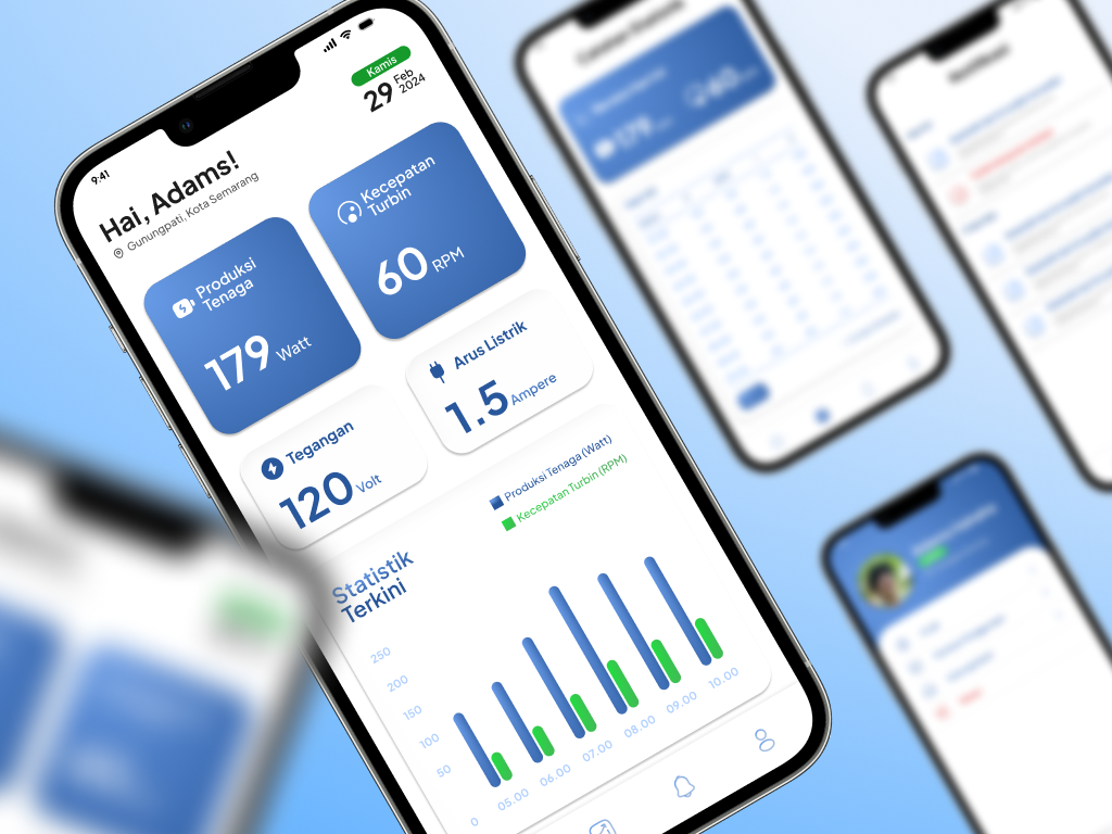
- Real-Time Data Visualization: Clear, high-contrast, real-time charts showing turbine speeds (RPM) and electrical output (Watts, Volts, Amps) across daily, weekly, or monthly filter views.
- Alert Customization: A dedicated notification tab showing automated system warnings (e.g., "Turbine rotating too slowly").
- Thumb-Friendly Statistics: High-priority metrics and quick navigation controls placed in comfortable touch zones for field usability.
5. Visual Direction & Final Mockups
- Color Palette: Dominated by shades of tech-blue, conveying clean, eco-friendly energy and technological precision.
- Typography: Highly legible, bold sans-serif typefaces designed to be readable in high-glare, outdoor, and low-light environments.
- Data Tables: Clean layouts with contrasting key indicators (e.g., showing green checkmarks for healthy status and warnings for failures).