
1. Project Background & Challenge
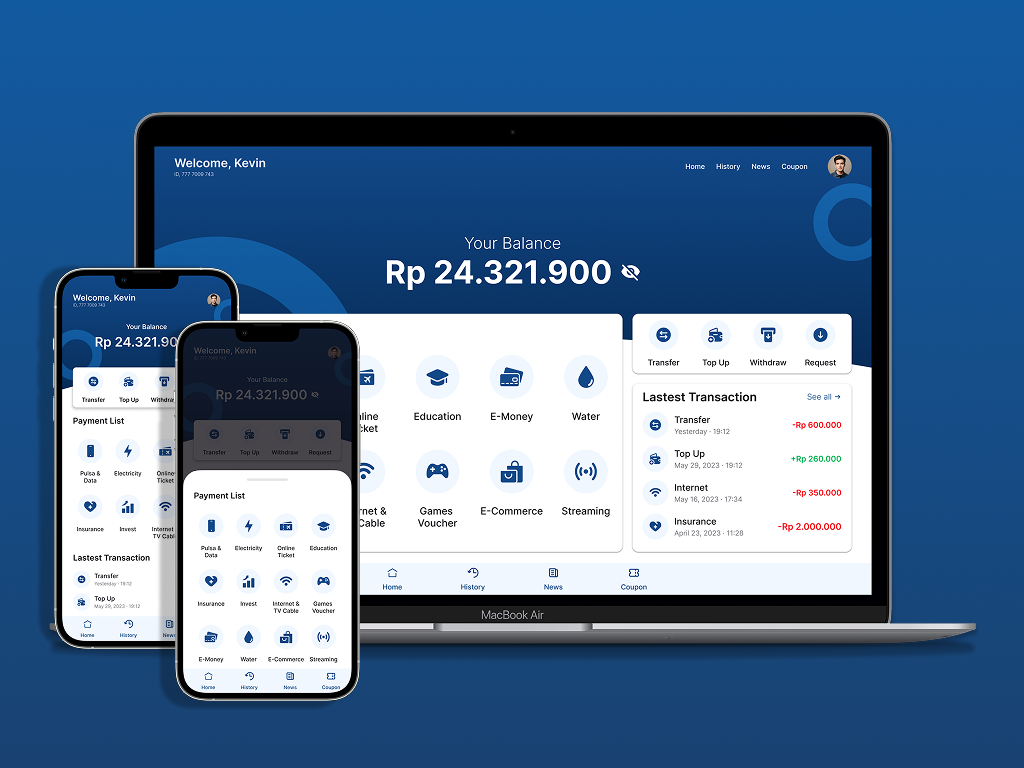
This project focused on the UI/UX design of a modern Digital Banking Application. The primary goal was to deliver a sleek, modern, and user-friendly interface without sacrificing the core sense of security and reliability (trustworthiness) essential to financial products.
Key Hurdles
- Seamless Responsiveness: Delivering a consistent, seamless experience across both high-resolution desktop monitors and small mobile screens.
- Data-Dense Layouts: Structuring rich, dense financial metrics (e.g., account balances, transactions list, and quick bill payment menus) in a highly readable format that reduces cognitive overload.
2. Visual Direction & Style Guide
Before jumping into layout structures, a solid visual theme was formulated to represent financial stability:
Color Palette & Space
- Primary Dominance: Deep, navy blue tones dominate the background. In color psychology, dark blue signifies stability, trust, and professional reliability.
- Contrast & Cards: To break the dark blue dominance and introduce light contrast, white cards with smooth rounded corners are overlaid. This offers a modern, clean, and lightweight visual feel.
Iconography
- Instead of using standard flat icons, duotone icons were selected. This adds a fresh, sophisticated visual layer and prevents monochromatic fatigue.
3. Responsive Solutions: Desktop vs. Mobile
Designing for responsiveness meant restructuring layouts fundamentally rather than simply resizing components:
Desktop Layout
- Hero Section: Leverages the generous horizontal workspace. The main account balance is positioned as the primary center of attention with privacy toggle controls.
- Payment & History Grid: The payment utility list is laid out in a wide horizontal grid on the left, balanced alongside the latest transaction logs on the right, enabling fast scannability.
Mobile Layout
- Stacked Vertical UI: The horizontal grids were transformed into a stacked vertical hierarchy to avoid cramping information.
- Thumb-Friendly Bottom Sheets: For extensive bill payment categories, scrollable sections and mobile bottom sheets are integrated to ensure critical functions are comfortably reachable with the thumb (thumb-friendly).
- Floating Bar Menu: Frequent actions like Transfer, Top Up, Withdraw, and Request are anchored to a prominent floating block at the top for quick on-the-go access.
4. Conclusion & Reflection
Designing UI for digital banking is a continuous act of balancing aesthetics and utility. Through this case study, I learned how strategic color application and breathing room (negative space) can translate highly complex numerical systems into clean, comfortable, and beautiful interactive products.